Hands-on Visionamusement shakes our visual world
In 2020, I saw Takashi Hinoda’s solo exhibition Howling Hands-on Visionamusement that was held at Galleria Finarte in Nagoya. This exhibition was announced as a follow-up to the solo exhibition at Imura Art Gallery the previous year, and one piece was shown at both venues so as to link them. At the time, I wrote that that was Hinoda’s distinctive style, in which he creates a new world to allow the works he created separately to jive with the exhibition space, rather than to demonstrate narrative continuity in line with chronological timing. Now, following the opportunity to read the artist’s notes for the current show, I would like to revisit that thought.
In recent years, there has been a string of exhibitions questioning what crafts (kogei) are, with a focus on a young generation that is actively incorporating new aesthetics and new methods while returning attention to materials and using the techniques of the so-called traditional crafts as a starting point. However, Hinoda’s work seems to be based on a slightly different kind of thinking.
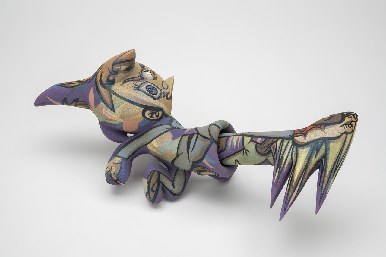
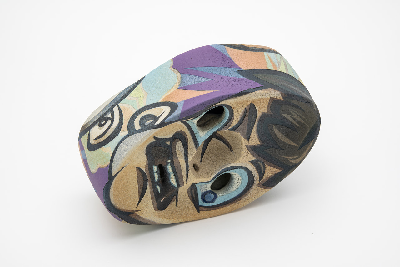
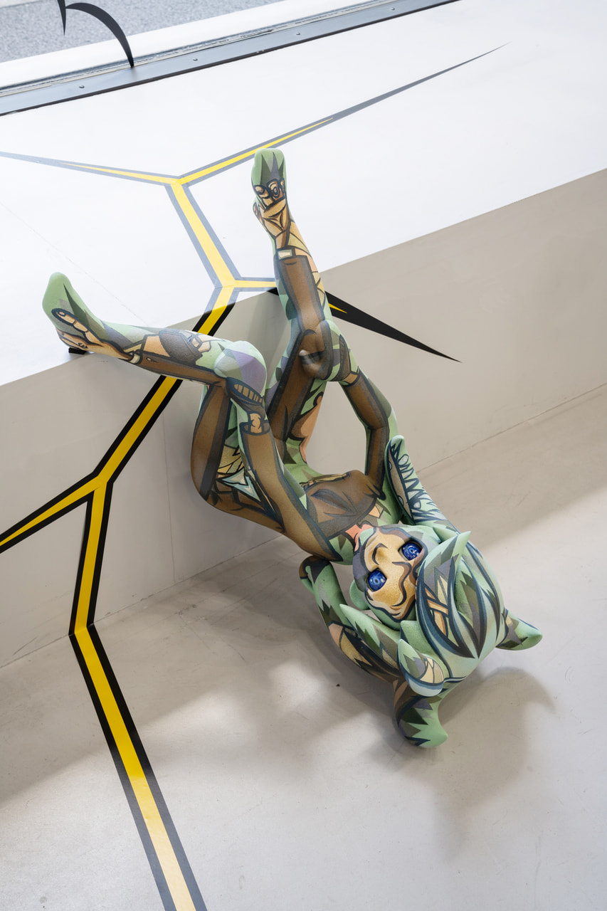
For Hinoda, color is one of the reasons for using ceramic art techniques. In his notes, he describes achieving an ‘incarnation’ of color in his art using coloring and substantiality only achievable through ceramic art—weight and texture produced using the mineral pigments employed in ceramic art, durability achieved after firing, and a distinctive darkness that is like shadow or shade not seen with other materials. However, the artist states that he uses clearly drawn lines, influenced by genres such as manga and ukiyo-e, because to him they convey a far stronger sense of psychological reality. When you stand in an exhibition space in which these works have been arranged, the pieces seen with your eyes also appeal to your tactile and auditory senses by way of your vision. You get the feeling that Hinoda chose the ideal materials and techniques in order to create this visual world.
The titles and themes of individual works reflect misgivings and a sense of crisis about modern-day society, but Hinoda asserts that it is the motifs that function as the motivation for his works. It is difficult to guess how Expanding Hands-on Visionamusement will stir our physical senses. It engenders anticipation like the excitement that builds on the way to a live gig.
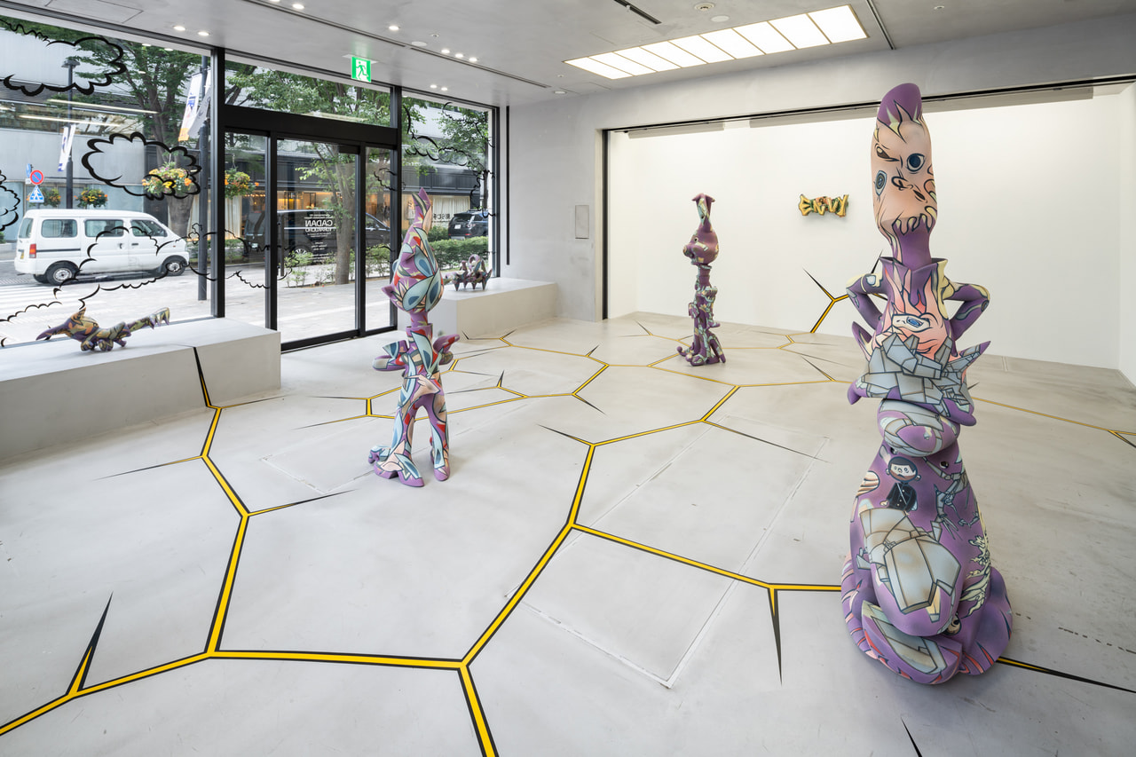
(Nodoka Murayama, curator, Mosaic Tile Museum, Tajimi)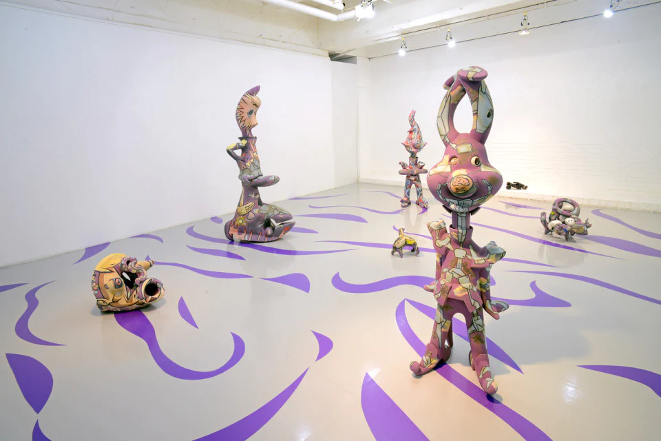 Installation view, solo exhibition "Howling Hands on Visionamusement"
Galleria Finarte,Nagoya 2020
Photo by Sakae Fukuoka
Notes on the Expanding Hands-on Visionamusement exhibition
Takashi Hinoda
I used the term Hands-on Visionamusement (Shushikikeigaku) for the first time in public when I held the solo exhibition Hands and Visionamusement at Imura Art Gallery in Kyoto in 2019. I coined the term to create a new framework that doesn’t really fit fully within what is understood in Japan by terms typically used here to describe art, such as bijutsu rendered in pictographic characters, the katakana phonetics for the English word “art,” or “art” spelled out in English. Hands-on Visionamusement refers to the creation of art using colors and shapes based on a physical medium, that is to say, something subjected to manual or physical intervention. It’s an approach that applies to many of my past works. It’s the act of creating three-dimensional art within the spatial and temporal constraints imposed by the nature of one’s own body, without indiscriminately expanding scale. It always takes a moderate, human-sized approach.
Hands-on Visionamusement references Orphism in art history, graffiti culture, and the coherence of the harmonies, melodies, and rhythms in the music of Ornette Coleman. The reason for bringing up the music metaphor is to create a solid form that can’t be easily reclaimed by concepts or linguistic systems. While color and form each convey a certain impression independently, what truly has an impact on the human mind is when they are combined with other elements, producing complex relationships and flows. In other words, rather than savoring specific sounds, colors, and forms, viewers are actually appreciating the spatial and temporal transformations occurring between sounds, colors, and forms, and compositions with contrasting strengths of sounds, colors, and forms.
There is one important point about color. Scientifically speaking, the mind perceives color based on the wavelengths of light reflected by matter. However, I feel that there is more weight and texture with mineral pigments used in ceramic art. Through firing, they gain semipermanent durability, a disposition not found with other materials, and a distinctive darkness that is like shadow or shade. This darkness cannot be found in video works and similar creations that are based on light. These colors are firmly linked with the texture and gravity-bound weight of the works. Producing them is an important part of my practice. I think of it as the incarnation of color.
Form is also the element that guides the simulated experience of space. Seeking a direction to go in, the viewer’s gaze glides over the surfaces and around the profile of the work, as if caressing it. It’s not just a visual experience using the retinas, but also a tactile act of tracing through three-dimensional space. People experience the form in a similar way to how they move their feet to follow a rhythm.
As a student, I was taught about incorporating techniques that were invented during the Renaissance in Western art to represent perspective and shading—which gave me a lot of trouble during my studies. But personally, when it comes to methods of dealing with color and form, I feel a far stronger sense of psychological reality in three-dimensional art bordered with clear outlines as seen in anonymous illustrations and manga, ukiyo-e, and Otsu-e folk art. In this context, I have been particularly influenced since the mid-2000s by works of American illustrator Jim Flora from the 1940s and 1950s.
In line with the term’s origins, I think of a motif (or motive) as the impetus or motivation for beginning a work, rather than being the content or subject contained within the artwork. That’s because the content of the work is nothing but colors and forms. However, it goes without saying that, as someone living in this age, I have a strong interest in the world and society. The timing of my life on Earth determines the character of my life. Nevertheless, whatever the motivation, the Hands-on Visionamusement works derived from it are eventually sublimated into different forms.
In this exhibition, rather than show my work in a way that the viewer would likely attach too much importance to thinking about, I attempt to create a three-dimensional presentation that resonates with the physical senses, using adhesive vinyl markings to create grooves in a form that links the painted ceramic sculptures, and by extension the gallery space.
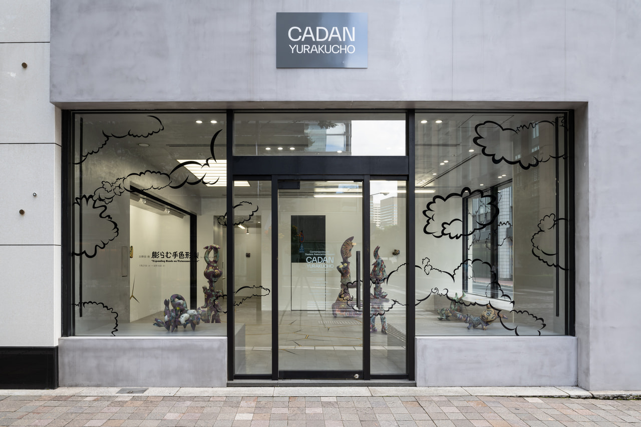
会期:2021年7月27日(火)~8月15日(日)
会場:CADAN有楽町(東京都千代田区有楽町1-10-1 有楽町ビル1F)
時間:火~金 11時~19時 / 土、日、祝 11時~17時
定休日:月(祝日の場合は翌平日)※会期中8月9日(祝)は営業、翌10日(火)は休業
最新の情報は、CADAN有楽町ウェブサイトでご確認ください。
https://cadan.org
この度、CADAN有楽町にて日野田崇の個展「膨らむ手色形楽」by imura art galleryを開催いたします。
「手色形楽」という言葉は、美術や工芸とはことなる日野田独自の概念で、作家にとっての色やかたちそのものの価値をもう一度見つめようという試みです。今回の個展では、この概念に基づいて制作された新作4点と近作を、カッティングシートで装飾された空間に発展・拡張して展示いたします。
素材に土を用いた陶芸という形式をとりながら、独特な有機的フォルムと、そこに描かれる二次元表現からなる作品は、唯一無二の存在感を放ちます。
日野田は、色やかたちに作品を観る者との意思疎通の可能性を感じていると言います。色とかたちは本来、伝達手段であり、言語という方法に囚われずに伝えられるものがあるのではないでしょうか。会場の作品群から、作家のことばを感じとっていただければと思います。
視覚世界を揺さぶる「手色形楽」
2020年、名古屋のガレリア・フィナルテを会場に開催された日野田崇の個展「吼える手色形楽」を観覧した。この展示は、前年に開催されたイムラアートギャラリーにおける個展の続編という位置づけで、1点の作品が両会場をつなぐように共通して展示された。それは物語的な時間軸に沿った連続性を示すためではなく、個々に制作されていた作品が、展示空間とセッションするように新たな世界を作り出していく、日野田ならではのスタイルだと、書いたことがある。今回、本人による本展のためのノートを拝見する機会を得て、改めて考えを巡らせてみたい。
近年、いわゆる伝統工芸の技術を起点としながらも、素材に立ち返り、新たな美意識や手段を積極的に取り入れる若い世代に着目し、「工芸」の在り方を問い直すような企画展が相次いで開催された。しかし日野田の制作からは、少し異なる思考が感じられる。
日野田にとって陶芸の技術を用いる理由の一つは、色にある。先述のノートによれば、「陶芸で使う鉱物質の顔 料」によって作り出される「重みや手触り」、焼成を経ることによる「耐久性」、さらには他の素材にない「陰のような独自の暗さ」、これら陶芸によってのみ実現可能な色合いと実在性によって、作品の色が「受肉」するという。一方、漫画、浮世絵などに影響を受けた明瞭な描線は、自身が「圧倒的な心理上のリアリティ」を感じるという理由で用いられている。これらの作品を配置した展示空間に立つと、目に映るものが視覚を通して、触覚や聴覚にも訴えかけてくる。日野田はこの視覚世界をつくるために、最適な素材と技法を選んできたように思うのだ。
個別の作品のタイトルやテーマには、現代の社会情勢に対する疑念や危機感もにじむが、日野田は、モチーフとは制作の「動機」であると明言する。「膨らむ手色形楽」と題する今回の展示ではどのように身体感覚が揺さぶられるのか、ライブに向かうような楽しみがある。
(多治見市モザイクタイルミュージアム 学芸員 村山閑)
個展「吼える手色形楽」展示風景 installation view, solo exhibition "Howling Hands on Visionamusement"
ガレリア フィナルテ/名古屋 Galleria Finarte,Nagoya 2020
撮影/福岡 栄 photo / Sakae Fukuoka
「膨らむ手色形楽」展のためのノート
日野田崇
私は、2019年にイムラアートギャラリー(京都)での個展「手と色形楽」をおこなった際に、「手色形楽(しゅしきけいがく)/Hands-On Visionamusement」という言葉を初めて公にして使いました。それは、「Art」、「美術」、「アート」の、どの腑分けにも完全に当てはまらない自身の制作を枠づけるための造語です。そして、それが指し示すのは、物質、つまり、身体や手を使ってなんらかの働きかけを行う対象を基盤にした、色とかたちを扱う制作です。それはこれまでの過去の自作の多くに対しても適用できる考え方です。
自分の身体の時間的、空間的な有限性を前提にして行う造形行為であり、むやみやたらにその規模を拡張することはありません。そこには人間の大きさにあわせた中庸さがつねにあります。
手色形楽のありようは、美術史上のオルフィスムや、グラフィティ文化のありよう、そして、オーネット・コールマンの音楽に見られるような、ハーモニー、メロディー、リズムの渾然とした状態を参照しています。ここで音楽の比喩を持ち出すのは、コンセプトや言語の
体系に容易に回収され得ない強固な形式をつくるためです。色やかたちは単体で、なんらかの印象をもたらしはしますが、それが真に人間の精神に働きかけるのは、他の要素と組み合わせられ、複雑な関係性、流れが生じたときです。つまり、見る人は音、色、かたちそのものを味わうというよりも、じっさいにはそのあいだに生じる空間的、時間的な変化や、強弱の対比の構成を鑑賞しているのだと言えます。
色に関しては、ひとつ重要な点があります。科学的な視点で見れば、物質が反射している光の波長によって脳の中に色の認識が生じているのでしょう。しかし、陶芸で使う鉱物質の顔料には、実感として重みや手触りがしっかりとあるように感じられます。そして、焼成されることによって、半永久的な耐久性が生じ、他の素材にはない調子、陰のような独自の暗さを持ちます。この暗さは光を基調にした映像作品などには見られないものです。ここでの色は肌合い、地上的な重さとしっかり結びついているように思います。このことは私にとって非常に重要で、色の「受肉」といえると思います。
かたちは空間の模擬体験を導く要素でもあります。人の視線は、作品の面や輪郭をなでるように滑っていき、方向付けられます。それは単なる網膜的な視覚体験ではなく、同時に触覚的な3次元空間のなぞりでもあるのです。人は足でリズムを刻むかのように、かたちを体験することができます。
色やかたちを実際に扱う手法に関してですが、まず私にとっては、西洋ルネサンスの発明した遠近法や陰影描写(これは自分にとって学校教育の中で非常に厄介な代物でした)よりも、作者不詳のイラストや、マンガ、浮世絵、大津絵などの描写に見られる明瞭な輪郭線で縁取られた造形のほうに、圧倒的な心理上のリアリティが感じられます。その文脈から述べると、とくに2000年代後半以降に私が大きく影響を受けたのは、1940-50年代に活躍したアメリカのイラストレーター、James Floraの作品でした。
また、モチーフに関してですが、これは言葉の本来の意味で、制作を始めていくときの動機となっているもので、作品の内包する内容、主題ではありません。作品の内容はあくまで、色とかたちであるからです。しかし、もちろんこの時代に暮らす一人の人間として、世界や社会のありようには強い関心を持っています。そしてこれは自分にたまさか与えられた生の時間を特徴づけるものです。しかし一方で、その動機から出発した手色形楽の作品は最終的にそれとは異なる形式へと昇華します。
今回の展示では、彩色された陶の立体、そしてその延長上にあるギャラリー空間を、カッティングシートを使った線などによって、ひとつなぎにするようなかたちのグルーヴをつくりだし、見る人が意識偏重的な意味を受け取るのではなく、身体感覚を使って共振することのできる造形を現出させることができればと考えています。